Last month I shared some concepts where “global” site elements could be managed in a dedicated area of the UI. In this post I’m expanding and refining those ideas a bit in an effort to explore the broader viability.
If global entities like styles, templates, and navigation menus can be edited in the Site Editor, then it seems feasible that folks may want to manage other parts of their site there as well.
The Site Editor was designed mostly to handle presentational things like posts, styles, and templates, but non-visual entities like users or settings need further consideration. Along with general content management, these are the kinds of things that I concentrated on here.
During these explorations two key UX requirements emerged:
- When a management view corresponds with something that could be edited visually, a direct and intuitive pathway between editing and managing should exist
- Since the lines between managing and editing can sometimes blur in the site editing context, a distinct visual language should help users orient themselves in the experience.
As is often the case with these things, pictures speak louder than words, so here’s a quick demonstration of how I envisaged a user zooming out of the editing experience to find access to management areas:
The button in the Editor acts as a pathway to the relevant management view. The dark colorisation of the button creates a visual hint towards the nature of the destination and helps to conceptually separate management and editing. Clicking the preview window takes you back into the Editor.
This pattern and design language satisfy the two points outlined above.
Is it a template? Is it a category? No, it… doesn’t matter
As yet we’ve not come up with any elegant pathways to edit entities where content and template overlap.
For example the “Posts page” in WordPress is presented (somewhat misleadingly) as a “page” in the backend, but always redirects to a specific template (not the page template, notably) when viewed on the frontend.
Similarly things like post categories have a content element – you can add a custom description – but right now you can only edit the archive template agnostically. It should be possible for folks to edit and create templates for specific categories without having to understand the technical cruft going on beneath the surface.
We can use the pattern above to contextually surface previews (and therefore editing access) on the relevant screens. As an example, here’s how I might edit a post category:
From this management view it is possible to invoke an instance of the Editor where you can customise the relevant content and template simultaneously. In this environment you might also be able to create a new dedicated template for this particular category.
The Finder-inspired columnar navigation creates the hierarchy of the drilldown pattern we explored in the past, while still providing direct access to the top levels of navigation – something the original drilldown lacked. If this feels like too many columns, tabs could be used for filtering instead, and the primary navigation could collapse down to icons as you navigate deeper in to a section:

But this doesn’t scale down quite as well to mobile devices. At this point it’s worth repeating that these are all very rough concepts…
Still, they hold up quite well in other areas of site management, and feel aligned with the idea of WordPress being an operating system for the web.
Media
Making quick edits to media meta is easy to imagine, and this pattern would translate well to other management areas. I can see a lot of value in being able to update things like publish dates, authors, titles, and so on, without launching the “full” editor.
Navigation menus
This hybrid management / preview screen is extremely useful when working with particularly complex menus that include lots of nesting.
Such menus get very tricky to directly manipulate on the canvas, but you can always click the preview to zoom in and do so if desired.
Templates, Styles, and settings


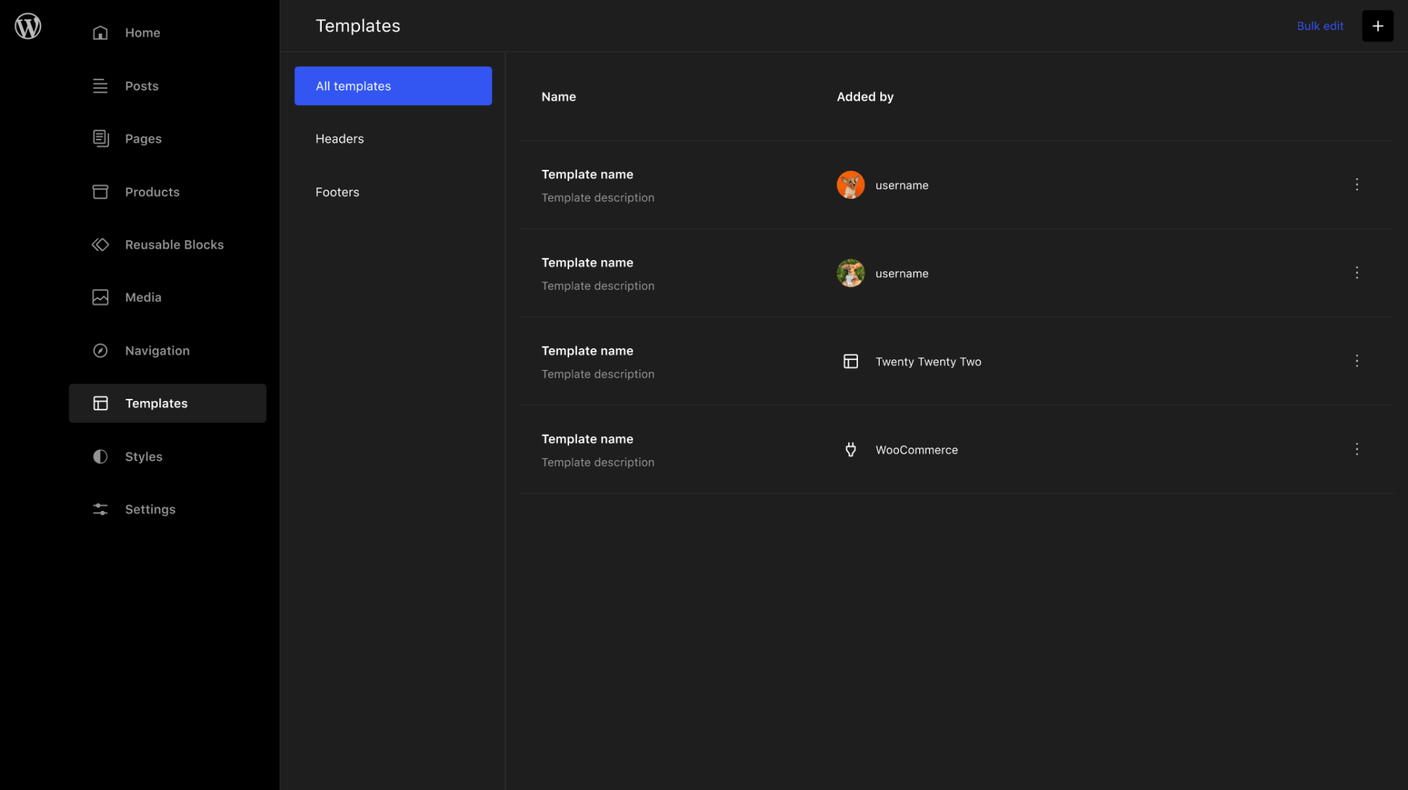
The template management above view is simply a dark-styled interpretation of the one we’ve already implemented for 5.9. A toggle to view the templates in a mosaic configuration (using the preview component) would be a nice enhancement that continues to build on the zooming metaphor.
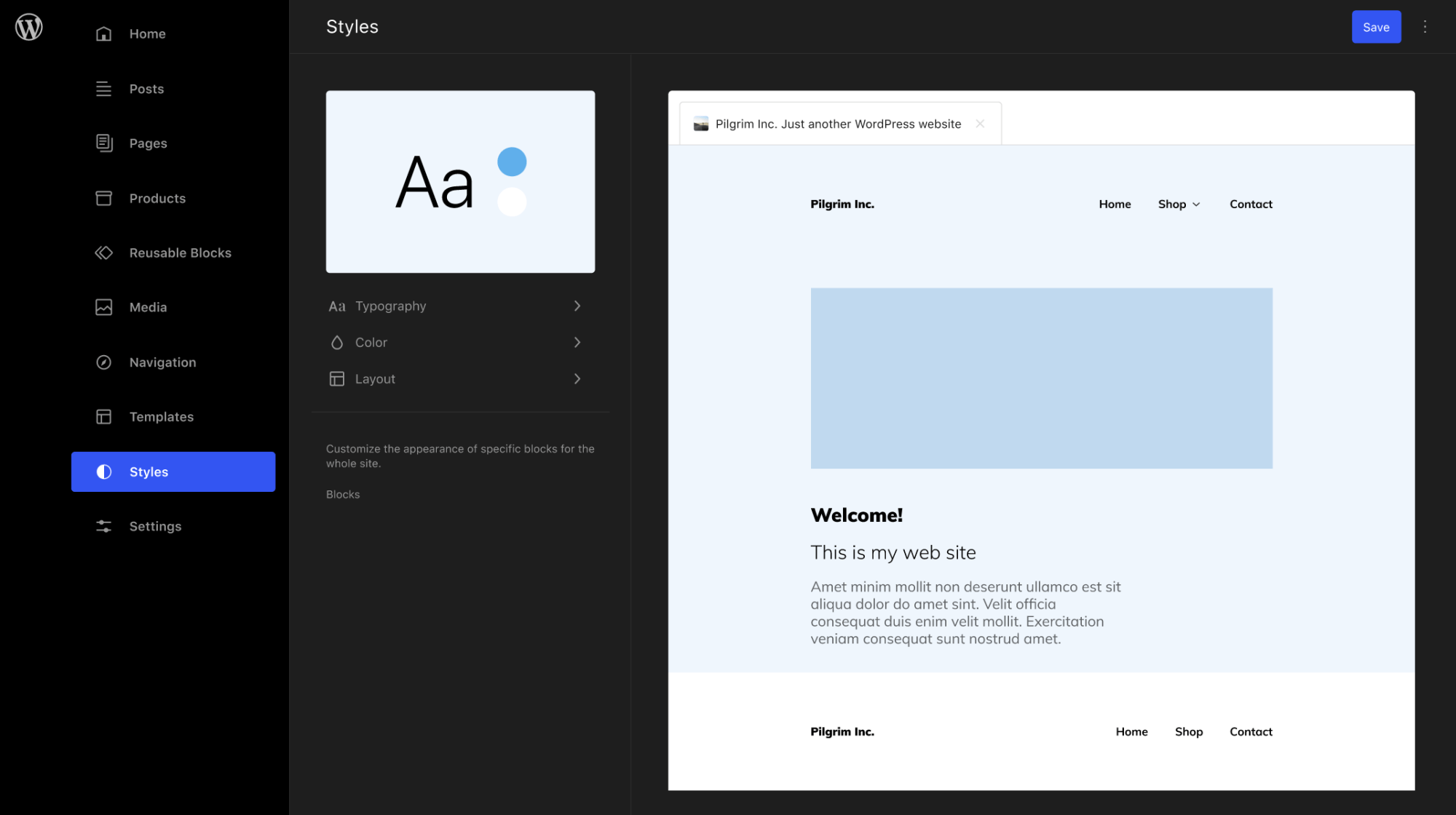
Likewise, Styles use the same panel that is shipping in 5.9. A mosaic of curated templates in the preview area could provide holistic feedback on style adjustments.
Visual settings like the site icon need to live in the Site editor. Options such as front page settings are also integral to the site editing experience. Folks shouldn’t have to go all the way back to wp-admin to do this. Once again the preview area adds value by clarifying the visual component of these options.
I’m not sure what the next step is here, but I’m hopeful to see some of these items worked on for 6.0. #36667 and #37001 seem like good candidates to explore further.
Leave a comment